什么是文字环绕
浮动的盒子会遮盖下面的盒子,但是下面盒子里的文字是不会被遮盖的,文字反而还会环绕浮动的盒子。
1 |
<html lang="en"><head><meta charset="UTF-8"><style> |
效果图
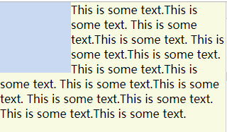
这里是float: left,使用float: right会在右侧文字环绕;
如果浮动的盒子在文字后面,不会形成环绕
防止文字环绕(BFC)
一般给出的方法都是在文字所在的盒子添加overflow: hidden产生BFC达到文字不环绕。
要使用其他方法参考理解BFC
其中也有不能使用,或者不适合的方式:
display中的inline-block、inline-flex、inline-grid、inline-table当文字内容过多所占用宽度超过浮动盒子margin box的右边到父级border box的右边(对于从左往右的格式化,否则相反)文字内容会换行;
可以手动指定内容宽度,这样就失去了意义。display中的flow-root也可以实现,但是兼容性不好。position中的absolute需要在外部设置position: relative同时还要设置位置;fixed就不要使用了。- 如果要使用
float需要使用宽度,同样也失去了意义。 column-span也不能解决问题。contain:layout、content、strict也可以实现,但是兼容性不好。
所以BFC方式如下属性和值暂未发现不妥的地方:
display:table、table-cell、table-caption、table-row、table-row-group、table-header-group、table-footer-groupoverflow:hidden、scroll、auto、overlaycolumns、column-count、column-width:兼容性一般
可能有些值会有副作用,发现之后再进行补充
防止文字环绕(非BFC)
给文字所在盒子添加margin-left或者margin-right等于浮动盒子margin box左边到右边的距离
上面代码添加如下代码即可
1 |
.word-el{margin-left: 100px;} |