定义
块格式化上下文(Block Formatting Context,BFC) 是Web页面的可视化CSS渲染的一部分,是布局过程中生成块级盒子的区域,也是浮动元素与其他元素的交互限定区域。
A block formatting context is a part of a visual CSS rendering of a Web page. It is the region in which the layout of block boxes occurs and in which floats interact with other elements.
BFC的原理
- 内部的box会在垂直方向,一个接一个的放置。
- 每个元素的margin box的左边,与包含块border box的左边相接触(对于从左往右的格式化,否则相反)。即使存在浮动也是如此。
- box垂直方向的距离由margin决定,属于同一个bfc的两个相邻box的margin会发生重叠。
- bfc的区域不会与浮动区域的box重叠。
- bfc是一个页面上的独立的容器,外面的元素不会影响bfc里的元素,反过来,里面的也不会影响外面的。
- 计算bfc高度的时候,浮动元素也会参与计算。
BFC的功能
你可以将BFC看作是页面中的一个迷你布局。一旦元素创建了一个BFC,它其中的所有元素都会被它包裹。正如我们所见的,当盒子变成BFC之后,它内部的浮动元素就再也不可能突破它的底部(也就是说,盒子不再会因内部元素浮动而坍塌)。
创建块格式化上下文方式
- 根元素或包含根元素的元素
- 浮动元素(元素的
float不是 `none) - 绝对定位元素(元素的
position为absolute或fixed) - 行内块元素(元素的
display为inline-block) - 表格单元格(元素的
display为table-cell,HTML表格单元格默认为该值) - 表格标题(元素的
display为table-caption,HTML表格标题默认为该值) - 匿名表格单元格元素(元素的
display为table、table-row、table-row-group、table-header-group、table-footer-group(分别是HTMLtable、row、tbody、thead、tfoot的默认属性)或inline-table) overflow值不为visible的块元素display值为flow-root的元素contain值为layout、content或strict的元素- 弹性元素(
display为flex或inline-flex元素的直接子元素) - 网格元素(
display为grid或inline-grid元素的直接子元素) - 多列容器(元素的
column-count或column-width不为auto,包括column-count为1) column-span为all的元素始终会创建一个新的BFC,即使该元素没有包裹在一个多列容器中(标准变更,Chrome bug)
实现
html(根元素或包含根元素的元素)
1 |
<html lang="en"><head><meta charset="UTF-8"><style> |
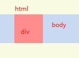
html根元素不因为内部元素的margin外溢,而body元素会外溢
float!=none(浮动元素)
1 |
<html lang="en"><head><meta charset="UTF-8"><style> |
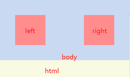
添加float之后会产生浮动脱离文档流,这时根据需要在外层清除浮动;如果在body元素清除浮动,overflow以外的方法都可以使用
position=absolute、fixed(绝对定位元素)
1 |
<html lang="en"><head><meta charset="UTF-8"><style> |
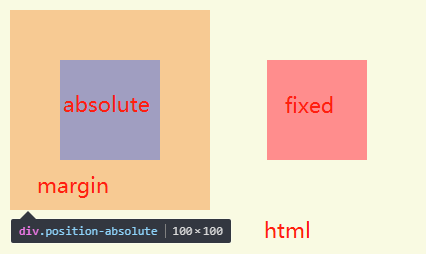
定位之后margin不会消失,但是会脱离文档流
如果不加位置数据,同样可以实现bfc,后续内容要使用margin-top撑开,等其他方法
display=inline-block(行内块级元素)
1 |
<html lang="en"><head><meta charset="UTF-8"><style> |
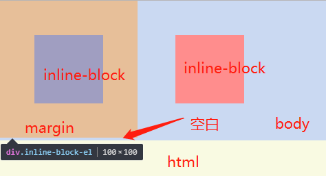
display: inline-block使用后margin不会穿透父元素,同时还需要解决如果两个inline-block在同一行,会有元素之间有空隙、元素上浮无法对齐的问题;
也可以作用在父元素上面,子元素margin属性不会穿透父元素,父元素也可能遇到上面两个问题;
display=table-cell(表格单元格)
1 |
<html lang="en"><head><meta charset="UTF-8"><style> |
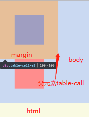
在父元素使用作为一个表格单元格,子元素margin属性不会穿透父元素;
display=table-caption(表格标题)
1 |
<html lang="en"><head><meta charset="UTF-8"><style> |
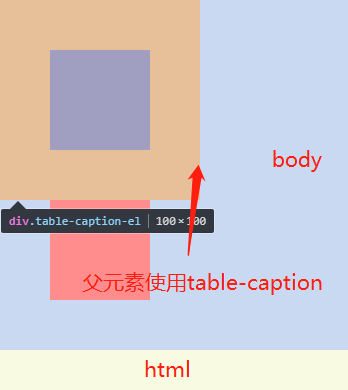
在父元素使用作为一个表格标题显示,子元素margin属性不会穿透父元素;
display=some value(匿名表格单元格元素)
元素的
display为table、table-row、table-row-group、table-header-group、table-footer-group(分别是HTML table、row、tbody、thead、tfoot的默认属性)或inline-table
table、table-row、table-row-group、table-header-group、table-footer-group的用法同table-caption,需要使用在父元素子元素才不会穿透父元素inline-table的用法同inline-block
overflow!=visible
1 |
<html lang="en"><head><meta charset="UTF-8"><style> |
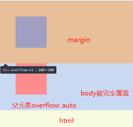
overflow属性为autohiddenoverlayscroll时触发bfc,其子元素margin不会穿透- 如果父元素为四个值时,当前元素可使用
inherit
display=flow-root
1 |
<html lang="en"><head><meta charset="UTF-8"><style> |
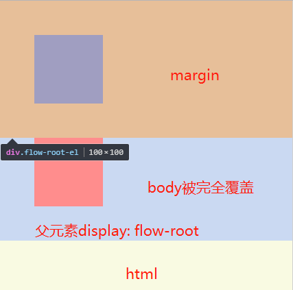
display: flow-root只支持Firefox 53+、Chrome 58+、Opera 45+,通过@supports能支持Edge
contain=layout、content、strict
1 |
<html lang="en"><head><meta charset="UTF-8"><style> |
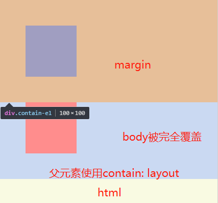
contain 属性允许开发者声明当前元素和它的内容尽可能的独立于 DOM 树的其他部分。
其中layout、content、strict 可触发BFC
display=flex、inline-flex(弹性元素)
1 |
<html lang="en"><head><meta charset="UTF-8"><style> |
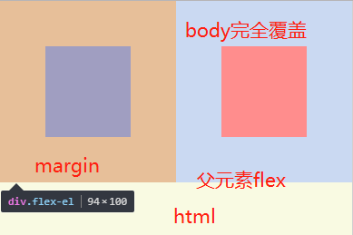
当为inline-flex时遇到的问题同inline-block
display=grid、inline-grid(网格元素)
1 |
<html lang="en"><head><meta charset="UTF-8"><style> |
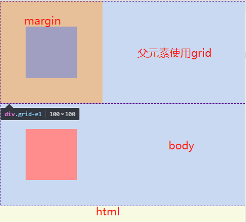
当为inline-grid时遇到的问题同inline-block
column-count、column-width!=auto(多列容器)
元素的 column-count 或 column-width 不为 auto,包括 column-count 为 1
1
2
3
4
5
6
7
8
9
10
11
12
13
14
15
16
17
18
19
20
21
<html lang="en"><head><meta charset="UTF-8"><style>
*{margin:0; padding:0;}
html{background: #f9fae2;}
body{background: #cad9f2;}
.column-wrap{
column-width: 200px;
column-count: 2;
}
.column-el{
width: 100px;
height: 100px;
margin: 50px;
background: #ff8d8d;
}
</style></head><body>
<div class="column-wrap">
<div class="column-el"></div>
<div class="column-el"></div>
</div>
</body></html>
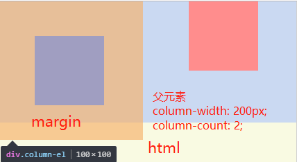
虽然截图中margin超出body边界,实际情况确是没有。
columns的使用方法见文末参考
column-span=all
1 |
<html lang="en"><head><meta charset="UTF-8"><style> |
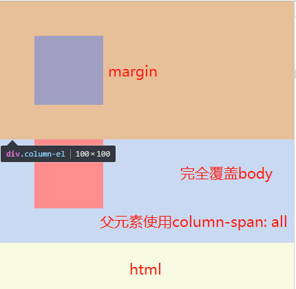
添加之后我行为异常
总结
触发BFC主要有一些几个元素
- 根元素:HTML
- float:不为none
- position:absolute、fixed
- display:inline-block、table、table-cell、table-caption、table-row、table-row-group、table-header-group、table-footer-group、inline-table、flow-root、flex、inline-flex、grid、inline-grid
- contain:layout、content、strict
- overflow:不为visible
- columns、column-count、column-width、column-span
应用场景
BFC的应用场景主要有一下几个方面,这里不做展开讨论,将单独写文章
参考
https://developer.mozilla.org/en-US/docs/Web/Guide/CSS/Block_formatting_context
https://developer.mozilla.org/zh-CN/docs/Web/Guide/CSS/Block_formatting_context
https://www.w3.org/TR/CSS21/visuren.html#block-formatting
https://drafts.csswg.org/css-display/#block-formatting-context
https://blog.csdn.net/woshinannan741/article/details/51113612
https://developer.mozilla.org/en-US/docs/Web/CSS/display
https://www.w3cplus.com/css3/display-flow-root.html
https://developer.mozilla.org/zh-CN/docs/Web/CSS/contain
https://developer.mozilla.org/zh-CN/docs/Web/CSS/columns
https://www.cnblogs.com/xinjie-just/p/5953386.html
https://www.cnblogs.com/chen-cong/p/7862832.html
https://www.w3cplus.com/css/understanding-css-layout-block-formatting-context.html